As we are building modular components there will inevitably come a time when
relationships between components will become needed. Specifically changing the
style of a child component when it is inside a parent component.
Traditionally we would be forced to write CSS code similar to this:
One of the last projects I completed before going away to Toronto in March 2012 I was a responsive web site and app for an annual Sitecore event called Digital Trendspot. This was a great project to be involved with as it used some features like Geo Location and CSS Media Queries to create a web site which could also be used as an app for the event’s attendees on the day.
I attended the second #anoraks talk last Thursday at AKQA in London. It was great to hear @denodell speak on responsive design. He did a really great job looking back at the past and some creative ideas for the future.
One thing which caught my attention was how he covered the topics of supporting older versions of IE. We’re in an intermediate stage with media queries where there are still a significant number of users out there who are on browsers which don’t support them.
I’ve come across some really good articles recently which I thought I would share.
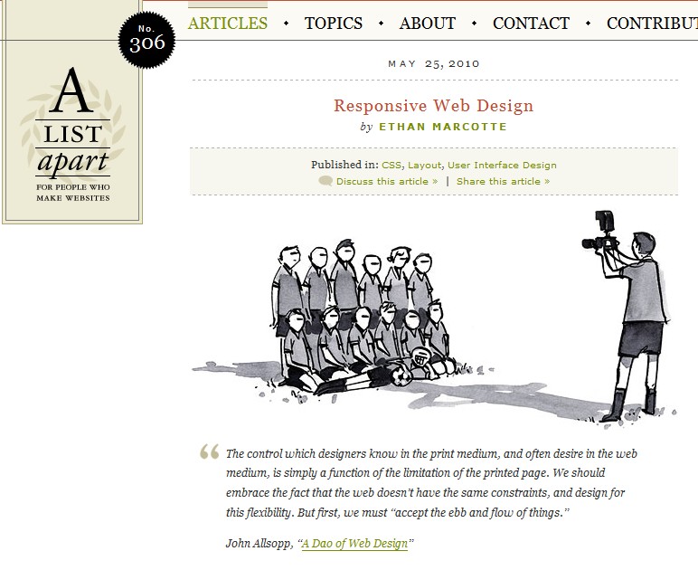
Responsive Web Design
There is a lot of talk going around about using CSS media queries to create flexible, fluid and responsive web sites. I have been doing some work at getting this website to restructure itself on smaller screens and I’ve found these articles really helpful.
 Dave Taylor - Software Engineer


